
- Project Corrections / Time spent:
I spent two hours on my Stamptildawn logo, my letterhead and my business cards. I opened the logo up in Adobe Illustrator and removed several of the sun rays in order to simplify the logo. Once I removed some of the rays I spent about 15 minutes adjusting the remaining rays around the sun. As I was adjusting the rays, I decided to adjust the gradient. I experimented with the gradient until I figured out how to adjust it on different pieces of the logo. I then selected each individual ray on the right side of the logo and adjusted the gradient so that the darker edge was closest to the sun. I spent 30 minutes testing different fonts for the words “Stamp Til Dawn.” Once I settled on the font, I adjusted the horizontal scale, kerning and tracking to allow ample room for the capital letters and improve readability.Once I completed the adjustments on the logo, I replaced the logo on the letterhead and the business cards. In moved the logo a little bit higher on the back of the card to create a larger bottom border. - Message:
The portfolio shows the skills I have developed as a designer, as well as the process and programs I have used to create the projects. - Audience:
My instructor and potential employers
- Top Thing Learned:
How to use the Adobe programs.
- Future application of Visual Media:
I have already been able to incorporate the things I have learned in this class at my current job as well as in my business. The skills I have learned will help me to create more effective flyers, handouts, brochures and websites as I continue in my career.
- Color scheme and color names:
Analogous – shades of Orange, yellow-orange and yellow
- Title Font Name & Category:
Myriad pro – sans serif - Copy Font Name & Category:
Minion Pro – serif - Thumbnails of Images used:
None – I created the background for my portfolio in Adobe Illustrator. I started with a pastel background and drew mountain shapes using the pen tool. I used the pathfinder tool to combine a rectangle with the mountain shape and then wrinkled the edges and applied a gradient. I repeated this process several times to create a variety of textures in the background.
P8 – Brochure

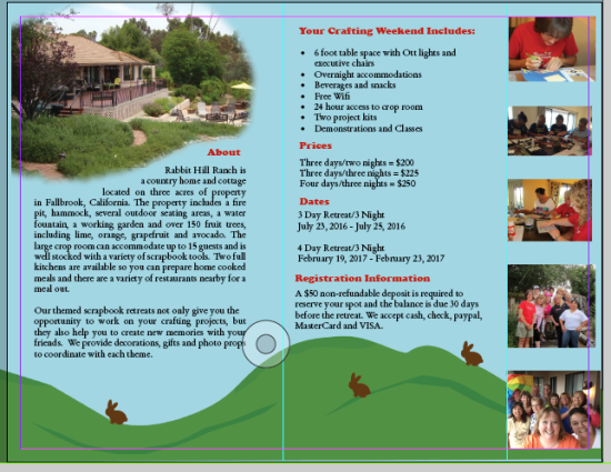

- Description:
Design a full-color folding brochure to promote a product or company. - Process (Programs, Tools, Skills):
This project required that I use a variety of skills, tools and programs. I started out by sketching the layout for the brochure and looking through my pictures to find ones that would convey the message the best. I had a very generic background on my first couple of drafts and it really didn’t suit the personality and the message that I was going for. Once I decided to incorporate the rolling hills and rabbits into the design, everything came together nicely.I created the sky background, the rolling hills, the bunnies and the logo in Adobe Illustrator. I used the “draw inside” feature on the wood plank and the rolling hills to help add some contrast and shading. I started with basic ovals and circles for the bunny and then used the pen tool and the direct select tool to add, remove and change different points. Once I was done I used the pathfinder tool to make it one image.Since there was an offset on my brochure, I had to experiment to figure out how to make the rolling hills line up when the brochure was folded. Ultimately I decided to add a picture so you’re unable to see that the hills align, but they do! I made my background 14 inches wide, instead of 11 inches. This allowed me to shift the background on the back and the front so that they would align when folded.
- Message:
Rabbit Hill Ranch has a fun and relaxing environment that is perfect for your next scrapbook retreat. - Audience:
Women, ages 25-70 who like to scrapbook and enjoy weekend get-aways with friends. - Top Thing Learned:
Draw-Inside feature on Adobe Illustrator and how to adjust background to line up when using an offset fold. - Color scheme and color names:
Split complimentary – Red, Yellow-Green, Blue-Green - Title Font Name & Category:
Cooper Black - Copy Font Name & Category:
Stempel Garamond LT Pro - Word Count of copy:
277 - Thumbnails of Images used:


- Sources (Links to images on original websites)
All images are mine.
Project 7 – Web Page

- Description:
Design a web page to showcase a personally created logo. - Process (Programs, Tools, Skills):
I used the Text Wrangler text editor to type all the content and code for my webpage. Once I had the basics of my website complete, I opened my logo in photoshop and used the eyedropper tool to get the hex code for the colors I used in the logo and added the color codes to my css file. Since I had a monochromatic color scheme, I experimented with a variety of shades for my text. Ultimately I decided to stick with black and white for my text because it was more readable and unified the look of the site with my logo. - Message:
The Dawn and Gail show is on YouTube. - Audience:
Close To My Heart consultants on Dawn and Gail’s Close To My Heart teams or those considering joining. - Top Thing Learned:
I was pretty comfortable with building the website and adjusting the css so I actually spent more time learning how to combine screen shots of my site in photoshop in order to share the picture here. - Color scheme and color hex(s):
Monochromatic – #6a999a - Title Font Families & Category:
Arial Black – sans-serif - Copy Font Families & Category:
Palatino Linotype - Changes made to the CSS:
Font families and colors - Word Count:
379
Project 6 – Stationary

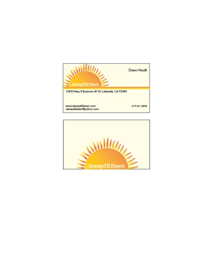

Description:
Matching letterhead and business card designed using a personally created logo.
Process (Programs, Tools, Skills):
I created the in Adobe Illustrator. I started out with a basic circle which I turned into a half circle using the pathfinder tool. Using the line tool, I drew a short line and then varied the width and turned it into a custom art brush. I then used the custom brush to draw the rays for the sun. I added a gradient to the sun and manually adjusted the gradient settings until I got the fiery look I was going for. I also drew three line segments and repeated the colors from the sun in those lines and then copied all of my design elements into an Adobe In Design file.
On the letterhead project I added my logo to the upper left-hand side and placed the three lines directly beneath it to simulate the horizon line and further emphasize the sun rising. I added the text to the upper right-hand size and then balanced it out by placing the email and website just below the logo and horizon line. I repeated the sun logo in the lower right hand side as a soft-yellow watermark, which served to add balance and unity to the document.
I added the business cards to the second page of my document. They are pictured at the actual size of 2″ x 3.5″. I used a soft yellow background and placed the logo image in the upper left-hand corner, just like the letterhead. I added a black outline to the images for additional readability since the soft yellow was so close to the white background of the document. I repeated the contact information used on the letterhead, but dropped the size down to 8pt. The phone number appeared larger than the rest of the text, so I decreased the size to 7 pt. and then used guide lines to make sure it was the same size and was aligned with both the name in the upper right and the website on the lower left side. I enlarged the logo and placed it on the second or “backside” of the business card.
Message: The stationary set is for an artist/stamping instructor known as “Stamptildawn.” Incorporating the sunrise logo helps to emphasize the name and make it more memorable.
Audience: Primarily females, ages 24-70 who enjoy stamping and papercrafts.
Top things learned: How to use custom art brushes in Adobe Illustrator, create a logo that can be used on a variety of products to create a custom branded look for a company.
Color scheme: Analogous – yellow, gold, orange
Title Font Name & Category: Charter- Serif
Copy Font Name & Category: Avenir Next – Sans Serif
P5-Logo Project
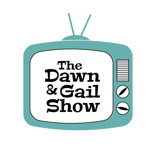 Description:
I chose to design a logo for a youTube channel show called the Dawn and Gail show.- Process (Programs, Tools, Skills):
I started out by sketching out a few ideas and experimenting with different ways to incorporate the name of the channel. Once I figured out what direction I wanted to go, I began reproducing my sketches in Adobe Illustrator. First I drew a simple, box-like tv, then I experimented with different effects to create a more bubble version. I drew several lines and then spaced them evenly apart using the alignment tool. - Message:
Quickly communicate the name of the youTube channel. - Audience:
Primarily female ages 25-75. Most are consultants for Close To My Heart or those thinking about becoming consultants. - Top Thing Learned:
I learned how to convert the image to greyscale. - Color Scheme and Color Names:
I chose a monochromatic color scheme using a color called Lagoon. - Title / Body Font Names & Categories:
Peralta – Serif
Project 4 Montage
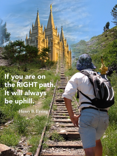
- Description:
Blend two or more images together gradually, using masks to create a layout with a dominant spiritual message. - Process (Programs, Tools, Skills, Steps taken while designing):
I started out by brainstorming different quotes I’d like to use. Once I settled on my quote I began looking for images that would work well. As soon as I located the hiking image I knew it would work well to blend it so that it looked like the trail led directly into the temple, so I sorted through a variety of temple pictures until I found one that was taken during the day and had similar color tones.I used the hiking image as my base image. I used the lasso tool to copy the temple from the second image and add it to the base. I added a mask to the layer with the temple and varied the opacity as I blended the two images together. I particularly focused on the stairs in an effort to make the stairs slowly fade into the temple at the top of the hill.
- Message:
The right path will always lead you to the temple. - Audience:
Members of the Church of Jesus Christ of Latter-Day Saints. - Top Thing Learned:
I learned to experiment with layers in photoshop and to apply and use masks to blend photos. - Filter / Colorization used and where it was applied:
I experimented with a variety of filters and colors on my text layers but they made the text more difficult to read. I ended up applying a small amount of color to match the ground behind a portion of the text to make it more readable. - Color scheme and color names:
I did not work with a specific color scheme, however I did select a temple picture that had a warmer tone instead of a stark white picture so that it would blend well with the outdoor hiking photo and unify the color of the umbrella in the hiker’s backpack. - Title Font Name & Category:
Avenir Black – Sans Serif - Copy Font Name & Category:
Adobe Caslon Pro Bold - Thumbnails of Images used:

- Sources (Links to images on original websites / with title of site):
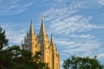
http://outoftheblueblog.us/surprised-by-god-tough-and-tender/file0002026387392/
Traveling again this week…different printer…different room … I like to keep things interesting. 🙂
P3- Photodesign

- Description:
Create a full bleed 8.5 x 11 sample artwork that demonstrates photography and Photoshop skills. - Process (Programs, Tools, Skills, FOCUS principles):After experimenting with photos earlier in the week, I decided to see if I could improve my product photos for my classes and workshops. I pulled together a few items for my next retreat. I paid close attention to the rule of thirds as I created the display. I adjusted the levels and the vibrance in photoshop to more accurately capture the colors of the products.Once I adjusted my image, I placed it in my project and used Photoshop to add design elements to my artwork. I pulled in the diamond shape from the paper in the photo by creating a diamond shape in Photoshop. I used the combine shapes feature and repeated the diamond creating three rows for the background. I pulled in the brick color by adding the rectangle and text.I used two distinctly different fonts in my text to add additional contrast and added the teal envelope to bring in the teal on the lower portion of the piece.
- Message:
The photo and choice of typeface helps to communicate the vintage feel of the craft retreats. - Audience:
Females, ages 25-75 that are looking for a fun getaway to work on their crafts. - Top Thing Learned:
I learned how to take better pictures with my point and shoot camera and I became much more proficient working with layers and design elements in Photoshop. - Color scheme and color names:
Complementary color scheme – Brick and Teal
Used grey as my neutral - Title Font Name & Category:
Marker Felt – Decorative Font - Copy Font Name & Category:
Rockwell – Serif - Thumbnail of original, unedited image inserted

- Date and location you took the photo(s)
Wednesday, February 3, 2016 in my home.
P3 – Photodesign Activity
Light 1 – Outside

Light 2 – Inside

Focus 1 – Foreground

Focus 2 – Background
Composition 1 – Thirds
Composition 2 – Lead Room

While I learned a great deal during this activity, I think I’ll need to practice quite a bit more to be more proficient with my point and shoot camera. I used a Canon Powershot ELPH 100 HS. I purchased this camera because I take a lot of pictures of artwork for my business blog. I needed a camera that had a great micro focus and worked well in low light. I love my little camera and it has served me well. Unfortunately, those features made it a bit difficult for me to blur the photos when I needed to for this assignment.
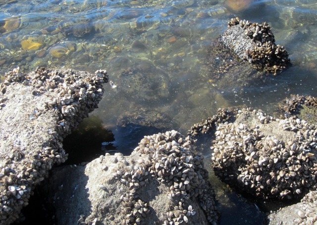
I took my first photo at Lake Murray Park in San Diego. I had to go in the middle of the day when the sun was the harshest. I was able to adjust the levels and the vibrance in photoshop to help the seagull stand out better against the blue sky. In the second photo, I experimented with the light indoors. I placed my artwork against my backdrop and used the existing light in the room. I experimented with the selective color tool in Photoshop to change the black box to purple. I attempted to take additional outdoor photos for the focus experiment after I left work, but the sun set too fast so I had to move indoors. I researched my camera online and took about 50 photos to try and get the technique to work. I was finally able to blur the photo, but I think I would be more successful if I didn’t try to blur and focus within the same bouquet. I need to stage a larger area and put something farther away in order to be more successful with the technique.
I was able to use one of my outdoor photos from Lake Murray for my rule of thirds photo. I was fascinated by all of the mussels/shells on the rocks at the lake and put them in the foreground of my photo, the additional rock jutting out of the water and the ripple of the water and the items beneath the water help to add depth to my composition. Finally I used the bouquet of flowers to demonstrate lead room on my last photo.
P2 Event Ad
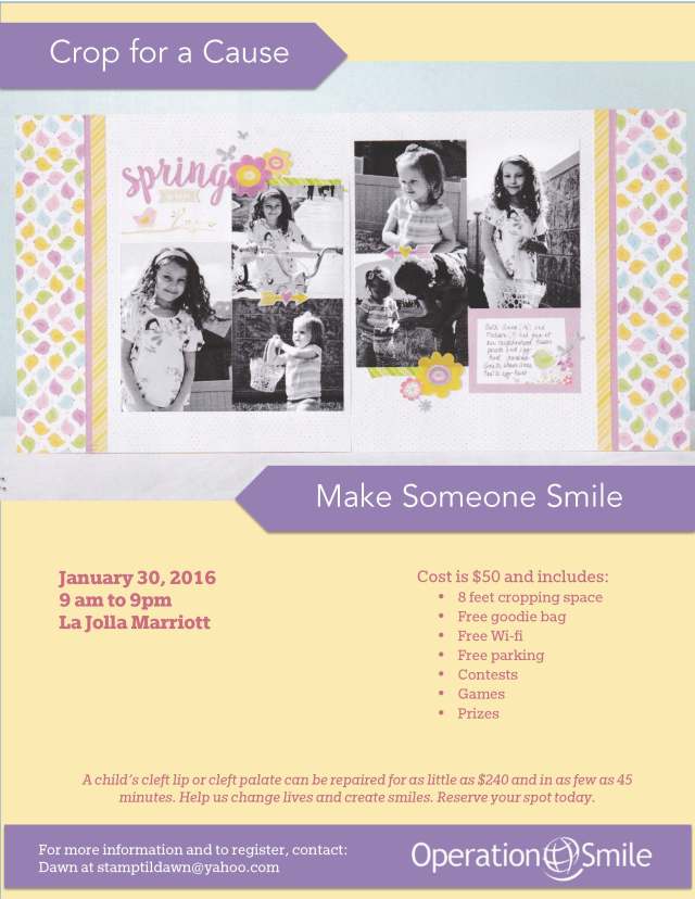
- Description: This week we created an ad for a benefit. I chose to create an ad for a Scrapbooking Crop to benefit Operation Smile.
- Process (Programs, Tools, Skills, FOCUS principles): Once I selected my benefit, I looked for images that would work well and appeal to my target audience. I scanned the image at 300 dpi and adjusted using the magazine setting in my scanner settings. This week we used Microsoft Word, a program readily available in most offices, to create our fliers. I used the tools in Word to draw the shapes, layer, align and arrange the images. I set the colors using hex codes.
- Message: Promote a fundraising crop to benefit Operation Smile.
- Audience: Scrapbookers/Crafters, primarily women ages 25-75.
- Color scheme and color names: Tetradic color scheme pulled from the photo, blue, purple, pink and yellow.
- Top Thing Learned: I learned how to adjust the print margins in Word and enhanced my scanning and editing skills.
- Title Font Name & Category: Avenir Book – sans serif
- Copy Font Name & Category: Egyptian Slate Std (bold, italic, normal)
- Scanned images used, sources, original sizes, location of scanner used: Scanned image from the Close To My Heart Seasonal Expressions January-April 2016, pg. 16. Original Size – 7″ x 4″, personal scanner located in my home.
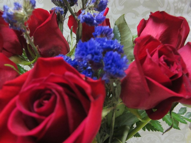
Still battling my cold.. maybe next week my voice will really be back!
Project 1 Flier

- Description: Class project – Black and white flyer for the Vouant Communication Graduate Leadership Conference
- Process (Programs, Tools, Skills, FOCUS principles): After contemplating my audience and the goals for this project, I created several sketches to experiment with placement of the key elements. Once I decided on a main design, I recreated the design using Adobe InDesign. I created contrast in my composition by varying the size and style of my typography. I created unity by repeating the grey in the client’s logo in the bar at the top and in the photo and by repeating the darker/bolder fonts. The generous amount of white space helps to simplify the design and allows for greater readability.
- Message: Students who have graduated can come learn valuable leadership skills that will help them as they begin their career.
- Audience: Male and female ages 23-30 who have completed their degree and are ready to develop their leadership skills.
- Top Thing Learned: I learned how to implement the steps of the FOCUS principles we have been studying while working on a project for a client.
- Title Font Name & Category: Neue Haas Grotesk Display – Sans Serif
- Copy Font Name & Category: Rockwell – Serif
- Links to images used in this project:
